# Front-end Development Guide
Version: 1.0 | Release Date: 30/6/2018
M18 front-end development is based on JSF (Java Server Faces)
The core concept in JSF is "component", a web page is rendered by a tree of "components", each component get its back-end value from EL Expression and show them in page; Update values input by user in front-end to back-end application server.
# JSF Page and Backing Bean
# Front-end Interaction
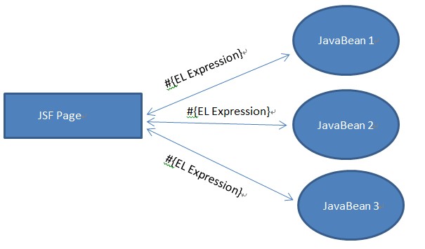
# JSF Interaction
JSF interaction with back-end, no matter it is for value binding or event feedback, it is done via EL Expression. JSF components in page bind with bean in the back-end through EL Expression, the relation between JSF page and backing bean is shown below:
# M18 Interaction
In M18, all JSF interaction mechanism is preserved, and support another type of interaction:
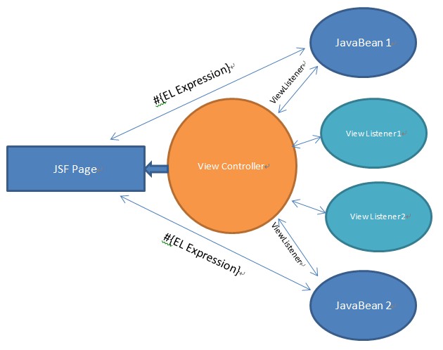
In M18, every view (JSF page) got a ViewController, which responsible for events distribution. For view, there can be multiple ViewListeners listening events triggered by ViewControllers and respond to it.
Attention:
- View and back-end data binding, can only done via JavaBean and Controller, view and JavaBean can use EL expression to do data binding. While via Controller can bind some temporary data, for details please refer to Support of Temp Data in Controller
- ViewListener listen to events only, and respond to them
- In general, one view, one JavaBean, but many ViewListeners
# ViewListener
public interface ViewListener {
	public default String getKey() {
		return this.getClass().getName();
	}
	public void controllerInitialized(ViewController controller);
	// for input
	public boolean validateValue(ValidateEvent ve);
	public void valueChange(ValueChangeEvent vce);
	// for action
	public void actionPerformed(ViewActionEvent vae);
	// for dialog
	public void dialogCallback(ViewActionEvent vae);
	// for lookup
	public default void lookupParameter(LookupDecorateEvent event) {
	};
	public default void lookupData(LookupDecorateEvent event) {
	};
}
# Interface Description
| Method | Required | Description |
|---|---|---|
| getKey | No | The key of listener in a view, used to identify a listener in a view by another listener. For details please refer to ViewListener Cross Visit. |
| controllerInitialized | Yes | Triggered when ViewController is initialized. Can be used to initialize data. |
| validateValue | Yes | This method is triggered when the value of component is submitted to validate the input value, false means validation failed. |
| valueChange | Yes | It is triggered after value is validated, and back-end model is updated, used to update other model's values based on the changed value. |
| actionPerformed | Yes | Used to respond to events submitted by front-end components. For example, commandButton click event, inputText focus, blur, change event. |
| dialogCallback | Yes | To handle current view's dialog callback event, for details please refer to Dialog Callback Method. |
| lookupParameter | No | It is called before the lookup data is retrieved from database. It allows developers to add conditions/parameters to specific lookup fields in the page. |
| lookupData | No | It is triggered after lookup data read, and before the data is presented to end-user. Allow developers to modify the final returned lookup data. |
Example:
//Examples
public boolean validateValue(ValidateEvent ve) {
	String id = ve.getComponent().getId();
	if("age".equals(id)) {
      if((Integer)ve.getNewValue() < 0) {
        return false;
      }
	}
}
public void valueChange(ValueChangeEvent vce) {
	String id = vce.getComponent().getId();
	if("code".equals(id)) {
      System.out.println("Code is changed");
	}
}
public void actionPerformed(ViewActionEvent vae) {
    String actionCommand = vae.getActionCommand();
    // String id = vae.getComponent().getId();
    if("ok".equals(actionCommand)) {
      System.out.println("Ok button is clicked");
    }
}
public void lookupParameter(LookupDecorateEvent event) {
    StParameter param = (StParameter) event.getSource();
  	//String componentId = event.getComponentId();  // If you want to know the UI component
  	param.setStSearch("user");
}
public void lookupData(LookupDecorateEvent event) {
    SqlTable data = (SqlTable) event.getSource();
  	data.setString(1, "desc", "modified by listener");
}
Attention:
All actions, including
commandButton, and actions added byajaxin front-end, will respond viaactionPerformed. Developers useViewActionEventto get component andajaxinfo.
actionCommandcan be used to distinguish the event triggered inactionPerformed. UseViewActionEvent.getActionCommand()to get theactionCommandin JavaBean.
  <caw:commandButton actionCommand="showDialog"/>
  <caw:inputText>
  	<caw:ajax event="change" actionCommand="showDialog"/>
  </caw:inputText>
# Add ViewListener to View
Developers can add ViewListeners to a view by the following ways:
- Simple ViewListener class (not Java Bean), simply add in navmenu.xml:
   <menu code="employee" ...>
     <listener>com.multiable.bean.view.ModuleViewListenerTest</listener>
     <listener>com.multiable.bean.view.ModuleViewListenerTest2</listener>
   </menu>
- For Java Bean's ViewListener, can declare in JSF page directly:
  <html ...>
  	<caw:view content="text/html">
  	<h:body>
  		<h:form id="formId">
  			<caw:beanDeclare name="employee"></caw:beanDeclare>
  		</h:form>
  	</h:body>
  	<caw:view>
  </html>
- In JSF page, add listener class:
<caw:viewListener class="com.multiable.bean.view.ModuleViewListenerTest"/>
- In Bean, declare a new ViewListener, and bind it in JSF page:
<caw:viewListener value="#{employeeBean.listener}"/>
   // EmployeeBean.java
   public ViewListener getListener() {
       return new ModuleViewListenerTest();
   }
# ViewListener Cross Visit
Inside ViewListener, if you want to access another ViewListener in the current View, you must know the key of another ViewListener that corresponds to the getKey () interface in the ViewListener.
The default value for key is the className of ViewListener. Modify the ViewListener instance by loading getKey ().
In ViewListener, other ViewListener instances can be obtained from the following code (this does not include the ViewListener in the form of a JavaBean because you can call other Java Beans directly through injection):
ViewListener[] listeners = controller.getViewListener(listenerKey);
# ViewController
# Get Controller
- To get ViewController of current View in ViewListener, developers can:
ViewController controller = CawBeanUtil.getViewController();
- For JavaBean's ViewListener, which extends
ViewBean,ModuleBeanor other ViewListener that extendsViewListenerBase, developers can usecontrollerto get the controller object.
# Support of Temp Data in Controller
If you need to bind some non-persistent variables in View through EL expressions, you can set variables through the controller without adding new variables and corresponding set / get interfaces to the Java Bean. This action can be done in all ViewListener.
- Setup variable values
controller.setVariable(String key, Serializable value)
  controller.setVariable("age", 18);
  controller.setVariable("name", "John");
  controller.setVariable("createTime", new Date());
- Get variable values
controller.getVariable(String key)
  int age = (Integer) controller.getVariable("age");
  String name = (String) controller.getVariable("name");
  Date createTime = (Date) controller.getVariable("createTime");
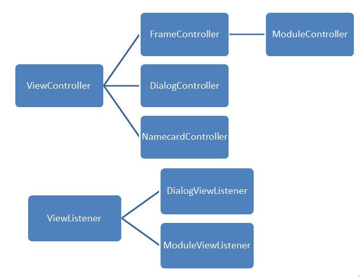
# ViewController/ViewListener Hierarchy
Attention:
- Every View got a ViewController, the controller can be one of the above controller objects.
- Any ViewListener can be added to any View, but different ViewListener interfaces contain specific methods that will only work in some specific ViewController.
- For View classification and its corresponding ViewController, pls refer to M18 UI Concept.
# M18 UI Concept
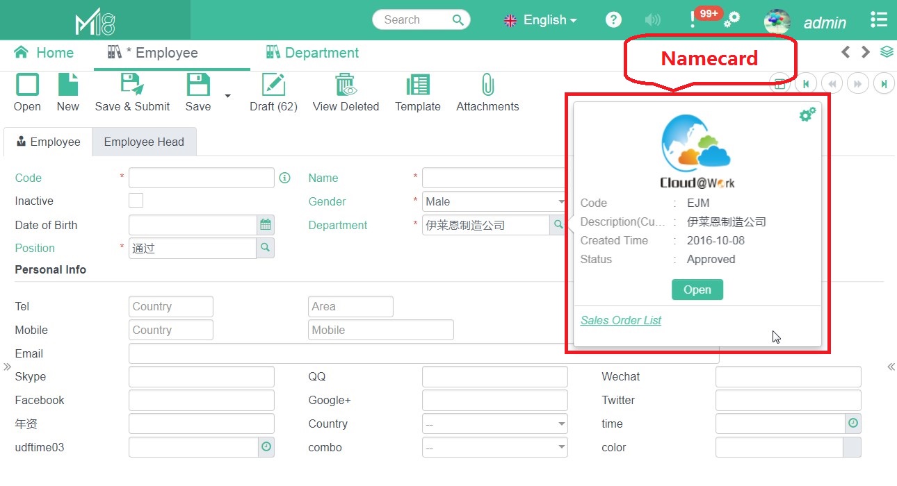
The M18 platform runs in a browser window. The documents and modules in the M18 platform are displayed as tabs in the M18 browser window.
- M18 browser window view, called "App View"
- In "App View", the view displayed as a tab is called "Frame View"
- In "App View", a pop-up window is called "Dialog view"
- In "App View", the small floating window that used to display additional information of a lookup field is called "Name card (Namecard view)
- All views have a separate view file (JSF file, xhtml format)
App View
Frame View
Dialog View
Namecard View
Module View
Same as Frame View. Module is only a special type of Frame View, it is a frame view which the data binded with back-end module data.
# UDF Screen Layout
Frame View supports end-user level of self defined layout.
M18 uses fluidPanel component to implement the UDF screen layout function.
# Introduction of fluidPanel
fluidPanel component is a layout component provided by M18, it is based on bootstrap 12 grids system.
fluidPanelmain attribute
| Name | Type | Description |
|---|---|---|
| column | int | Define the no. of columns in the layout, must be a factors of 12, recommend to use 1, 2, 3 or 4. |
More attributes' detail can be found in: M18 JSF Component
Layout Properties of Components in fluidPanel
The components in fluidPanel use tag constraints (namespace = http://www.cloud-at-work.com) to set layout properties, like below:
<html xmlns="http://www.w3.org/1999/xhtml" xmlns:caw="http://www.cloud-at-work.com"...>
  ...
  <caw:fluidPanel id="layoutPanel" column="3">
    <caw:inputText id="text1" ...></caw:inputText>
    <caw:inputText id="text2" ...>
      <caw:constraints colSpan="2"></caw:constraints>
    </caw:inputText>
    <caw:imgUpload id="img1" ...>
      <caw:constraints rowSpan="4"></caw:constraints>
    </caw:imgUpload>
  </caw:fluidPanel>
  ...
</html>
constraintsmain attributes
| Name | Type | Description |
|---|---|---|
| rowSpan | int | Row span of the component |
| colSpan | int | Column span of the component |
| newLine | boolean | Component will start in a new row |
| rowFill | boolean | Component will fill the remaining space in current row |
| rowHold | boolean | Component will occupy whole row, if there is other components in current row, the component will start in a new row |
| styleClass | String | Set class for the DIV of the component |
| style | String | Set style for the DIV of the component |
# Rules of Layout
Developer must follow the below rules, if they want their frame view to support UDF Screen Layout:
- Use
fluidPanelcomponent to do layout. - Only direct child components of
fluidPanelcan be involved in UDF screen layout. fluidPanelcomponents and all components in thefluldPanel, must have an ID, and the ID must be unique in the view.
Advise to developers:
- Do not use
fluidPanelrecursively:
  <caw:fluidPanel id="layout" column="2">
    <caw:fluidPanel id="nest" column="2">
      ...
    </caw:fluidPanel>
    ...
  </caw:fluidPanel>
For Relatively fixed positioned component, do not directly put it under
fluidPanel.If you expect some components to be placed under the
fluidPanelas a whole, you can use other layout-related components, encapsulate these components, and place them under thefluidPanel. Layout-related components arefieldGroup,container.
# Component Implementation Rules
ID must be filled, and must be unique
- M18 interface allow 3PD to extend and develop, and 3PD need the ID to do the extension like adding new fields in an editor.
- In order to support UDF screen layout, components must have ID.
clientIdis needed when developers want to find/update the components, however,clientIdis auto generated by the system and will be changed every time user opened an browser. this greatly increase the maintenance costs. Therefore, M18 provides an alternative to get the component based on a fixed component ID.
Layout using
fluidPanel, a page can be divided into different region, each region usesfluldPanelto do layout.In the module, the page's components is mapped with the back-end data by specifying the
tableNameandcolumnName. Component ID can be generated accordingly.In general, the
idcan be set and data can be binded in the component using the following snippet:
<caw:inputText id="text1" value="#{xxxBean.textValue}"></caw:inputText>
In module view, data can be binded in this way:
<caw:inputText tableName="xxTable" columnName="yyColumn"></caw:inputText>
For component that with tableName and columnName filled, it will auto bind to back-end's entity, and the id will be auto generated(id = tableName_columnName).
# Include Resources in JSF Page
In all view files, you only need to import the specific css/js resources for the current view. System-wide resources will be automatically loaded.
Automatically loaded resources include:
jquery.js、tether.js、bootstrap.js、cawView.js、bootstrap.css、cawStyle.css、cawTheme.css, etc.
# Frame Development
# Frame and Module
Frame is defined in
navmenu.xml, showing as a "Tab" in App View, one can click the menu to enter the Frame View
Module means frame that has back-end data binding.
Controller of Frame View is FrameController, event listener is ViewListener
Controller of Module View is ModuleController, event listener is ModuleViewListener
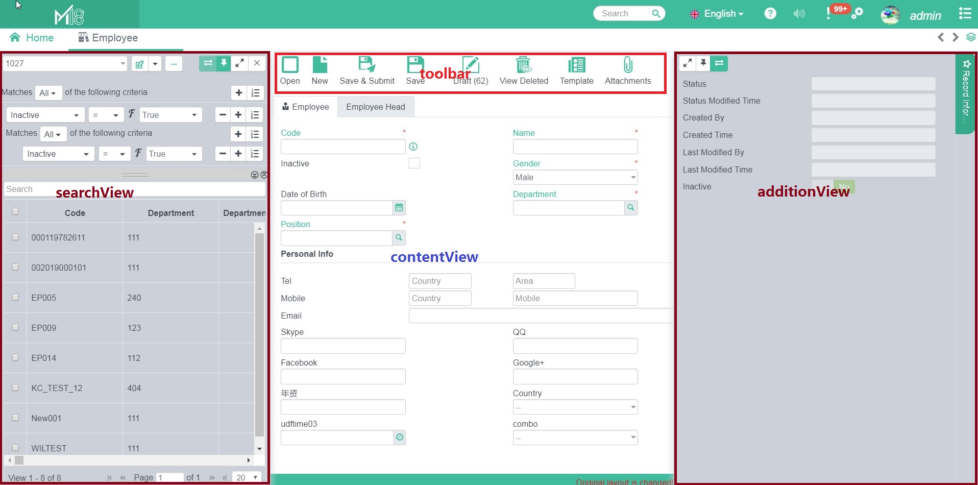
# Frame Template
M18 provides an unified frame template to simplify coding of frame page.
The template includes four parts:
searchView: navigating recordsProvide a default implementation; 3PD can override.
contentView: show record dataCan be fully implemented by 3PD.
toolbar: put various operations function buttonsProvide a default implementation; 3PD can override.
additionView: show additional info of the recordProvide a default implementation; 3PD can override.
How to use Module Template
<!--
xmlns:ui="http://java.sun.com/jsf/facelets"
xmlns:caw="http://www.cloud-at-work.com"
-->
<ui:decorate template="/view/template/viewTemplate.xhtml">
  <ui:param name="adtPage" value="false"></ui:param>
  <ui:define name="toolArea">
      <!--toolbar-->
  </ui:define>
  <ui:define name="toolbar">
  	<caw:actionItem label="customed" action="customAction" actionListener="#{xxxBean.doAction}"></caw:actionItem>
  </ui:define>
  <ui:define name="searchView">
     <!--searchView-->
  </ui:define>
  <ui:define name="additionPanel">
    <!--additionView-->
  </ui:define>
</ui:decorate>
Attributes:
| Parameter Name | Type | Default | Description |
|---|---|---|---|
| hideSearchPage | boolean | false | Hide searchView |
| hideRecordInfo | boolean | false | Hide "record info"“ |
| hideRightToolbar | boolean | false | Hide the buttons in the top right hand corner |
| hideToolbar | boolean | false | Hide toolbar |
| hideBeSelect | boolean | false | Hide Business Entity combo box |
| adtPage | boolean | false | Hide additionView |
| searchLayoutConfigurable | boolean | true | Indicate if searchView layout is configurable |
# Frame Events
List of events developer can listen to a Frame.
# JavaScript Events
| Event | Description |
|---|---|
Frame.Event.SIZECHANGE | Triggered when frame size changed |
Frame.Event.MODSTATUS | Triggered when front-end components send data to back-end or status changed |
Frame.Event.INIT | Triggered when the view is initialized |
Frame.Event.ACTIVED | Triggered when the view is selected/activated |
Frame.Event.DEACTIVED | Triggered when the view is unselected/deactived |
Frame.Event.CLOSING | Triggered when the frame is closed |
All of the above events can be directly used in JavaScript:
$(document).on(Frame.Event.ACTIVED, function(event) {});
$(document).on(Module.Event.ACTIVED, function(event) {});
# Java Events
Bind events and back-end using ajax.
Support events:opened, closed, active, deactived, dialogReturn.
<caw:frame>
  <caw:ajax event="opened" listener="#{xxxBean.doAction}" process="@this"></caw:ajax>
</caw:frame>
# Module Events
# JavaScript Events
Module got all events of a Frame, and provide BEFORE and AFTER events for each of the below events:
Module.Event.BEFORE_ + Event Code and Module.Event.AFTER_ + Event Code
| Action | Event Code |
|---|---|
| Refresh | REFRESH |
| Create | CREATE |
| Save | SAVE |
| Save As | SAVEAS |
| Rename | RENAME |
| Save as Draft | SAVEASDRAFT |
| Save as Template | SAVEASTEMPLATE |
| Delete | DELETE |
| Read | READ |
PRINT | |
| Print as Excel | PRINTASEXCEL |
| Print as HTML | PRINTASHTML |
| Print as RTF | PRINTASRTF |
| BE Change | BECHANGE |
$(document).on(Module.Event.AFTER_SAVE, function(event) {});
# Java Events
Based on ViewListener, module provides ModuleViewListener which contains more method for implementation.
# Dialog Development
# Introduction
Dialog is a pop up window that will block and lock the underlying view.
Dialog Container
Dialog view is located in Dialog Container.
M18 present two different dialog views: App View and Frame View
Attention:
- Dialog will lock / block Dialog Container until the dialog is closed.
- For dialog in Frame View, it will only block the associated Frame, other frame views can still operate as normal.
- For dialog in App View, the entire M18 Application will be blocked until the dialog is closed.
Dialog Type
Dialog, based on the purpose of data, is classified into 3 types:
- String/Text
HTMLformat- Independent JSF File(JSF View)
Attention:
- Dialog will not block the processing thread, even back-end bean use
WebUtil.showDialog, Dialog will not be shown immediately until back-end thread is completed and request will then be sent to front-end.- Callback function can be defined and will run upon dialog closing. For detail please refer to Dialog Close and Callback.
- For dialog that have back-end data binding, there is a
CawDialogobject in back-end. With the help fromCawDialog, more setting/action on dialog can be done, for details, please refer to CawDialog Description.
# Prompt the Dialog
# Using JavaScript
//myView is an instance of JsView, which is defined in CawView.js, exist in every JSF View.
myView.showDialog({
   message: 'This is a message dialog'
});
myView.showDialog({
   html: '<p>This is a html message</p>'
});
myView.showDialog({
  url: '/jsf/view/dialog/dlgView.faces',
  target: 'frame', //optional, if not input will use current frame.
});
For the available dialog's setting, please refer to Dialog Setting.
# Using Java
//Show text message
WebUtil.showMessage('Text message', 'Dialog Title');
//Show HTML
WebUtil.showHtmlMessage('<p>Html text message</p>', 'Dialog Title');
//Show JSF View
WebUtil.showDialog('/jsf/view/dialog/dlgView.faces');
//Use CawDialog
CawDialog dialog = new CawDialog("/view/dialog/dlgView");
dialog.setDialogName("dlgView");
dialog.addRequestParam("param1", "value1");
dialog.addRequestParam("param1", "value1");
WebUtil.showDialog(dialog);
Detail of CawDialog please refer to CawDialog Description
# CawDialog Object and Dialog's Setting
# CawDialog Object
Core methods of CawDialog:
| Method | Description |
|---|---|
setDialogName(String name) | Specify the name of the dialog, which is used in Callback to distinguish different dialog. |
setTarget(DialogTarget target) | Define the dialog container. Options:DialogTarget.frame , DialogTarget.app |
setType(DialogType type) | Define the dialog type:Options: DialogType.message, DialogType.html or DialogType.custom |
setContent(String content) | When type is DialogTarget.message and DialogTarget.html, variablecontent is the message; when type isDialogTarget.custom,content is the URL. |
setWithResponse(boolean value) | Indicate if there is any callback method to run after dialog closed. |
addRequestParam(String key, Object value) | Only valid when type is custom, set the request parameters of target dialog URL. |
addParam(String key, Object value) | Only valid when type is custom, used to pass the data to target dialog, the data is passed by session. |
setOption(String key, Object value) | Define dialog options, detail please refer to item 8 - 17 in Dialog Setting. |
# Dialog's Setting
| No | Option | Type | Description |
|---|---|---|---|
| 1 | dialogName | String | Specify the name of the dialog, which is used in Callback to distinguish different dialog. |
| 2 | dialogId | String | Unique ID of dialog |
| 3 | dialogParent | String | Define the parent dialog ID, if empty, system will auto detect. |
| 4 | dialogHandler | String | Only used in JSF component development, set the component that react to dialog callback. |
| 5 | url | String | Define the URL of custom dialog in JSF file |
| 6 | message | String | Define the message of text dialog |
| 7 | html | String | Define the html of html dialog |
| 8 | title | String | Define the title of dialog |
| 9 | ftype | String | When dialog type is message / html, set the action buttons. Options: confirm, askif |
| 10 | width | int | Define the dialog's width in px |
| 11 | height | int | Define the dialog's height in px |
| 12 | maxView | boolean | Indicate if the dialog should be maximized. |
| 13 | resizable | boolean | Indicate if the dialog is re-sizable. |
| 14 | draggable | boolean | Indicate if the dialog is drag-gable. |
| 15 | maximize | boolean | Indicate if the dialog can be maximized. |
| 16 | onClose | JS Function | Define the JavaScript function to run upon dialog is closing. |
| 17 | onCallback | JS Function | Define the JavaScript function to run after dialog is closed and before callback running. if return false, callback will be canceled. If return a JavaScript object, can pass the parameters to callback in back-end. |
3 ways to set Dialog Options
When using JavaScript to show dialog, use
myView.showDialog(dialogOption).When using Java to show dialog, use
CawDialogto set.For custom dialog, use
<caw:dialogOptionin JSF view like below:
<caw:dialogOption width="500" height="600" title="myTitle" draggable="true" resizable="false" maximize="false" maxView="false"></caw:dialogOption>
# Dialog Close and Callback
# Dialog Close
When the dialog is closed, there are two outputs:
- Closing status, includes
OK,CANCEL,YES,NO. - The
returnObjectobject, which is the data that will be passed to callback.
Methods to Close the Dialog
JavaScript:
myView.closeDialog(dialogId, status, returnObject);
Java:
Only can be done in DialogView:
//controller is DialogController object
controller.closeDialog(DialogStatus status, Object returnObject);
# Dialog Callback
Dialog callback will be triggered when dialog is closed, the operation will be based on dialog status and returned data.
There are 4 ways to add callback methods
- In dialog's parent frame (the frame that the dialog is prompted), use
dialogHandlerto specify the callback:
<caw:dialogHandler actionListener="#{dlgParentBean.dialogClosed}"/>
   //dlgParentBean
   public void dialogClosed(FacesEvent event) {
       String dialogId = (String)event.getComponent().getAttributes().get(WebConstants.Dialog.CONVERSATION_PARAM);
   	if (dialogId != null) {
   		CawDialog dialog = FacesUtil.getContext().getAttributes().get(dialogId);
         	 if("dialog1".equals(dialog.getDialogName())) {
                //do callback for dialog1
            }
   	}
   }
- In dialog's parent frame, use
ajaxtag to mark callback for dialog:
   <caw:dialogHandler>
     	<caw:ajax event="dialogReturn" actionCommand="dialog1" listener="#{dlgParentBean.dialog1Callback}"></caw:ajax>
   </caw:dialogHandler>
   //dlgParentBean
   public void dialog1Callback() {
       //do callback for dialog1
   }
- Declare in Java code of the prompted dialog:
WebUtil.showDialog("/jsf/view/dialog/dialog1.faces", "dialog1", (dialog) -> {//do callback});
   CawDialog dlg = new CawDialog("/view/dialog/ebi/ebiLinkSettingModuleRule.xhtml");
   dlg.setCallback(new DialogCallback() {
     private static final long serialVersionUID = 1L;

     @Override
     public void processAction(CawDialog dialog) {
       if (DialogStatus.OK.equals(dialog.getCloseStatus())) {
        	//do callback
       }
     }
   });
   WebUtil.showDialog(dlg);
Declare in ViewListener:
Only need to implement the below method in ViewListener:
   //ViewListener of parent frame of the dialog
   public void dialogCallback(ViewActionEvent vae) {
   	CawDailog dialog = vae.getSource();
     	if("dialog1".equals(dialog.getDialogName())) {
           //do callback for "dialog1"
       }
   }
This is the simplest and the most recommended way.
# Messaging Mechanism
# Introduction
During back-end processing, we always need to feedback some messages (including errors) to front-end, this section describes how to use JSF messaging mechanism.
Message can be added in the back-end when processing an request from font-end. However for the messages to be presented, there must be front-end components responsible for rendering JSF messages. Therefore, developers need to specify the components to render the message in JSF view.
Messages can be binded or not binded to a component. Messages that are not binded are called global messages, and messages that binded are called component messages.
# Message Classification
There are three types:
Built-in JSF Message
Can only displayed in specify components:
   //Component message:  MessageUtil.postMessage(String clientId, FacesMessage message)
   MessageUtil.postMessage(WebUtil.getFacesId('id'), new FacesMessage('Message Summary', 'Message Detail'));

   //Global message: MessageUtil.postMessage(FacesMessage message)
   MessageUtil.postMessage(new FacesMessage('Message Summary', 'Message Detail'));
Notice Message
There is default display for this kind of message, developers do no need to specify the component. If developers specify a component to display, system will not automatically display it in UI.
   //MessageUtil.postNotice(String message)
   MessageUtil.postNotice("Notice message");

   //MessageUtil.postNotice(MessageType type, String message)
   MessageUtil.postNotice(MessageType.INFO, "Notice Message");

   //MessageUtil.postNotice(MessageType type, String message, boolean htmlMessage, int delayClose)
   MessageUtil.postNotice(MessageType.INFO, "<p>Notice Message</p>", true, 3000)
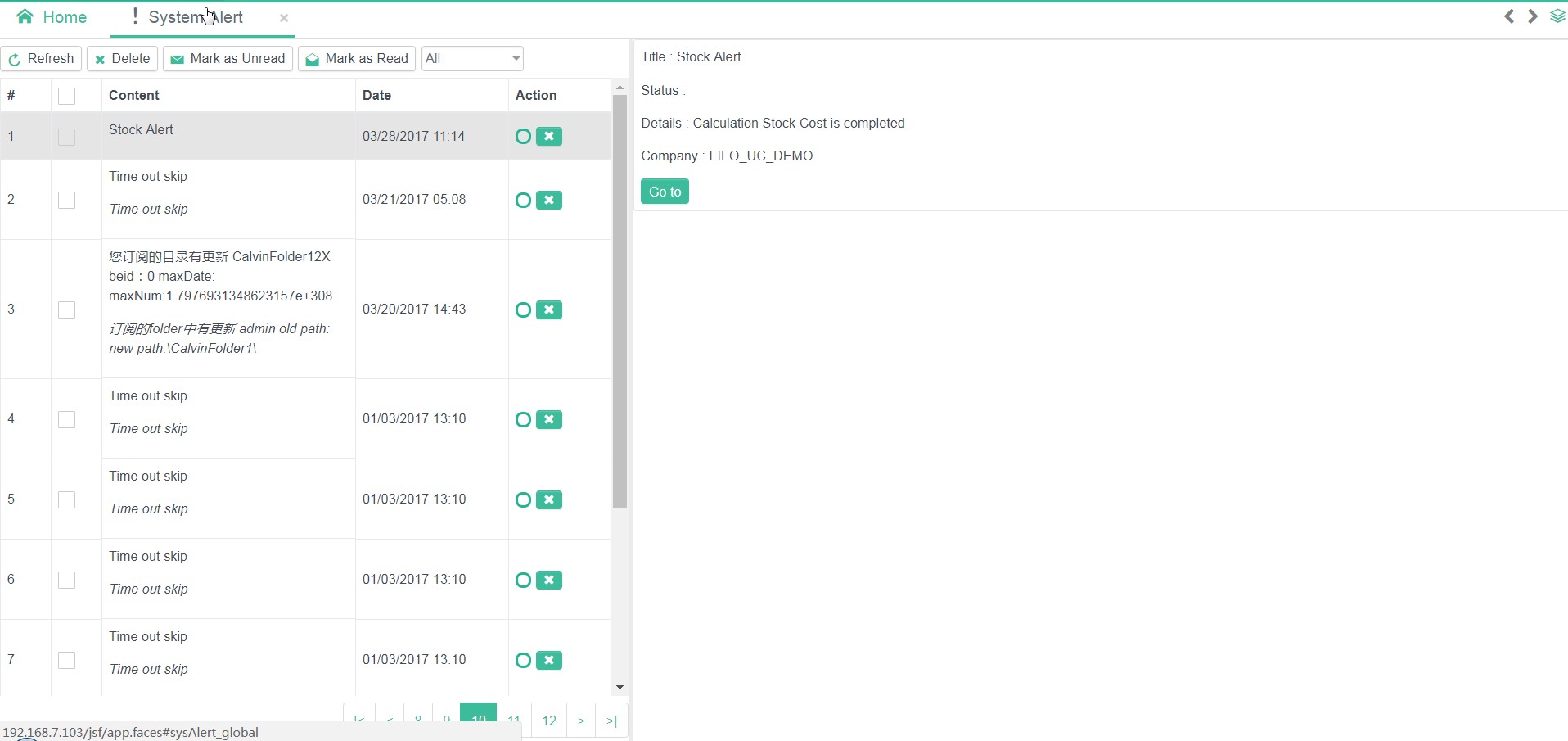
Message in Message Center
Message Center is a messaging mechanism designed for Frame View. It is used to provide detail message to user regarding various system operations.
Message Center is used to display the
CheckMsgobject which is mainly warning/error messages returned by back-end.Message Center display
ActionMessageobject,it provides two types of interaction:ActionMessagecan locate and highlight specific component in the underlying frame view:
     ActionMessage message = ...;
     FieldLocator locator = ...;
     message.addLocator(locator);
ActionMessageprovidedsmessageKeyandmessageDatawith brief and detailed message to end users.
     ActionMessage message = ...;
     message.setMessageKey('core_101');
     message.setMessageData(object);
When the ActionMessage is generated using CheckMsg object, field locations, messageKey, and messageData are automatically generated based on CheckMsg.
Display of message center:
Can add message to message center by:
   //MessageUtil.postMessage(String message)
   MessageUtil.postMessage("Message");

   //MessageUtil.postMessage(MessageType type, String message, boolean autoClose, boolean closable)
   MessageUtil.postMessage(MessageType.INFO, "Message", true, true);

   //Generate ActionMessage
   ActionMessage message = MessageUtil.createMessage(MessageType.INFO, "Message Text", false, true);
   message.setMessageKey("messageKey");
   message.setMessageData(object);
   MessageUtil.postMessage(message);

   //Generate message from CheckMsg
   MessageUtil.postMessage(MessageUtil.createMessage(msg));
# Message Center
Every message in message center is separated into 2 parts: list view and detail view
# Define Detail View in JavaScript
This method only works in single view.
Define detail view for messageKey="core_101"
$.extend(Messager.render, {
   'core_101' : {
       renderTitle: function(msgCenter, msg) {
           return 'Customed title';
       },
       renderView: function(msgCenter, msg) {
           var view = $('<div>Customed detail View here</div>').appendTo(msgCenter.detailView.find('.detail-body'));
           return view;
       }
   }
});
# Define Detail View in Java
This method works in multiple views.
- Register the view in
app.xml
   <message-render>
     <from-view-id></from-view-id>
     <message-case>
       <key>core_201</key>
       <render></render>
       <to-view-id>/view/message/fkMessage.xhtml</to-view-id>
     </message-case>
     <message-case>
       <key>core_160503</key>
       <render></render>
       <to-view-id>/view/message/fieldGroupMessage.xhtml</to-view-id>
     </message-case>
   </message-render>
Attention:
Can have multiple
message-render.
from-view-iddefine the view that will use the current message center detail view, if not specify, it will apply to all frame views.
message-casedefine type of messages.
keymeansmessageKey.
renderis optional, it is the class that implementedMessageRenderinterface.
to-view-iddefine the JSF file of the target view.
view-paramdefine the parameters passed to the target JSF view.
- Program detail view page
   <caw:view contentType="text/html" data-width="568px" data-height="278px">
   	...
   	<h:body>
   		<div><h5>#{message.info}</h5></div>
   	</h:body>
   </caw:view>
Attention:
- Define the size of the detail view by setting
data-width,data-heighton<caw: view>inpx- Get
messageDatavia#{message}in the page- The following snippet showing how to get
messageDatain the Java Bean / ViewListenerObject messageData = FacesUtil.getContext().getELContext().getLambdaArgument("message");
- M18 provided a base Bean type
CawMessageBean. Extending this class can getmessageDataby variablemsg.
# Self Defined Messages
If you still need to customize the message behavior, please refer to the components: messages and dynamicMessages
# Namecard Development
Namecard is a mini pop-up window to show additional information of a field, mostly used in lookup fields.
For example, when mouse over the department lookup field, a namecard will be shown to show the department name/description, etc..
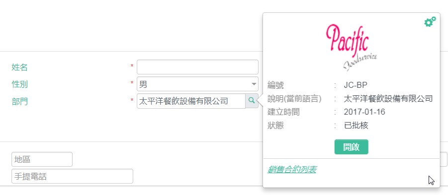
# Namecard Trigger
Namecard will be shown when mouse over JSF component:
Components that fulfill below conditions will trigger namecard:
- Component has
data-lookupattribute, set to a type instSearch.xml
<input id="text1" type="text" data-lookup="employee"/>
Component can get the
idinfo oflookupdataMethods to add
lookupdata- Use
data-idtag in HTML component
- Use
<input id="text1" type="text" data-lookup="employee" data-id="5"/>
- Use JavaScript
     $('#text1').on('active.nc', function(event) {
        $(this).data('id', 5) ;
     });
# Create Namecard
Namecard display is based on : data and display template
Namecard data includes 3 parts:
- All data returned by the lookup
- Attachment files
- URL links
Deverlopers/Users can set "file data to be shown in namecard" and "URL link to be shown in namecard"
Namecard Display Template is one of the method to show/display namecard
Developers can develop new template, and they can choose template for specific lookup
Attention:
- M18 define default "display data" for all
lookup, developers can add "display data",- M18 provides default namecard template, developers can set properties of default template or create the template themselves.
# Namecard Data
<stSearch ...>
  <namecard height="400" widht="250" src="" imgCode="photo" extendDefault="true">
    <field name="code" mess="core.code">
      <link ...>...</link>
    </field>
    <link menuCode="employee" id="empId" text="Go to employee" href="">
      <param name="beId" field="beId" value=""></param>
    </link>
    <option template="templateCode" templateOption="{}"></option>
  </namecard>
</stSearch>
namecard attributes
| Name | Description |
|---|---|
| height | Height of namecard |
| width | Width of namecard |
| imgCode | Set an image for the default template |
| src | Define a JSF View file to show the namecard. If not empty, default namecard template will not be used. |
| extendDefault | Default is true. When true, add field and link based on default template, when false, default template is not used. |
field attributes
field used to add fields to namecard.
| Name | Description |
|---|---|
| name | lookupfield name |
| mess | Mess code of field |
field can be a link, when the link is set, users can click the link on the namecard and will be redirected according to the link.
link attributes
link used to add additional link to namecard.
| Name | Description |
|---|---|
| menuCode | Menu code of editor, can be found in data dictionary |
| id | Define the field need to pass to the target editor as an id. |
| text | messCode of the link |
| href | If link to external resource, please input url. |
| needBe | Indicate if Business Entity need to change in the target editor. |
link can also set by param.
paramattributes
| Name | Description |
|---|---|
| name | Parameter name to pass to the link |
| value | Parameter value to pass to the link,String type. |
| field | The lookup field that the parameter value come from. |
# Namecard Template
Developer can use option tag, to change the display template of a namecard, attributes described below:
| Name | Description |
|---|---|
| template | The namecard template code |
| templateOption | The template options in json format |
Namecard's size can be set using the following snippet:
<caw:namecardOption height="500" width="200" />
# Namecard Template Development
Namecard Template is used by developers/end-users to apply lookup's namecard.
Developers uses namecard tag in stSearch.xml to set the namecard template.
End-user uses define the "Namecard" tag in "UDF Lookup" to set the namecard like below:
# UDF Namecard
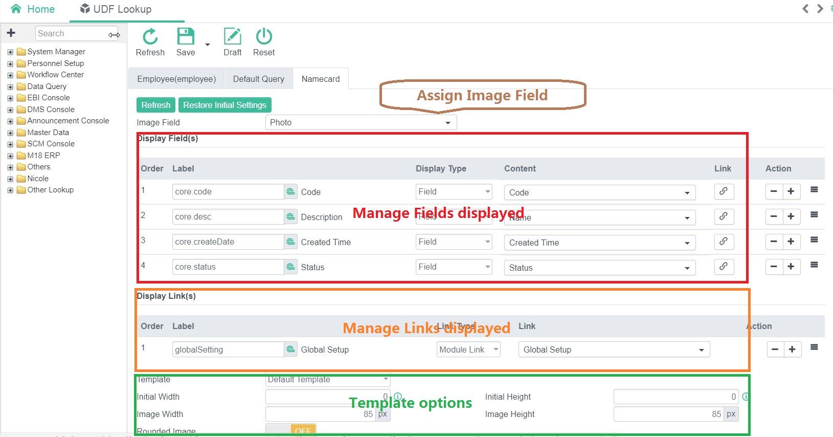
All the options in the above are provided by corresponding namecard template.
# Development
Namecard Template only responsible for showing namecard data. Setting page is needed for end-users if options are provided to them.
# Registration
Register namecard template in app.xml.
<template>
  <namecard code="verticalNamecard" description="core.defaultNamecard">
	<page>view/namecard/verticalNamecard.xhtml</page>
	<setting option="com.multiable.web.config.VerticalNamecardOption">
      /view/namecard/verticalTemplateSetting.xhtml
    </setting>
  </namecard>
</template>
namecard attributes
| Name | Description |
|---|---|
| code | An unique code of the template |
| description | messCode of the template |
| lookupType | Define the lookup type that will apply this template. , separated. |
page for setting namecard template view file.
setting for setting namecard template setting view file, there is option attribute:
| Name | Description |
|---|---|
| option | Java object used to specify the setting data (must be a simple JAVA object with set / get methods and can be grabbed as json using fastjson) |
# Template View
Template is a JSF view file, follow all JSF rules and there is no extra limitation.
In this view, developers can use global variables that have already defined:
| Expression | Return Value | Description |
|---|---|---|
#{namecard} | NamecardInfo | NamecardInfocontains all setting info of the namecard |
#{option} | The java object stated by option attribute in the setting tag in namecard registration in app.xml | |
#{namecardBean} | NamecardBean | NamecardBean is a SessionScope`Java Bean。 |
#{namecard.fields} | List<NamecardField> | Return all displayed fields in namecard |
#{namecard.links} | List<NamecardLink> | Return all additional link URLs in namecard |
#{namecardBean.imageCode} | String | Return the image code of photo in namecard |
#{namecardBean.getText(field)} | String | Get text of the namecard field |
#{namecardBean.isFieldRendered(field)} | boolean | Check if a field is rendered in namecard |
#{namecardBean.getLinkUrl(link)} | String | |
#{namecardBean.isSystemLink(link)} | boolean | True if the link is internal link. |
{namecardBean.isLinkRendered(link)} | ||
#{namecardBean.openSupport} | boolean | Indicate if open transaction function is supported |
#{namecardBean.printSupport} | boolean | Indicate if document printing is supported |
#{namecardBean.attachSupport} | boolean | Indicate if attachment should be shown in the transaction. |
#{namecardBean.attachment} | SqlTableIteratorModel | Return all attached files in the namecard, can use JSF <c:foreach>,<ui:repeat> to handle the data |
# Namecard Setting Editor
Setting Description
<setting option="com.multiable.web.config.VerticalNamecardOption">
  /view/namecard/verticalTemplateSetting.xhtml
</setting>
option should define a class that support JSON conversion, which means to support JSON.toJSONString(optionObject)andJSON.parse(String, optionClass) using fastJson.
Recommendation: Write as POJOs, for complicated java class, please implement JSONserializerandJSONDeserializer.
Setting Page (View)
The setting UI must be inside the <ui:composition></ui:composition> tag.
<!DOCTYPE html PUBLIC "-//W3C//DTD XHTML 1.0 Frameset//EN" "http://www.w3.org/TR/xhtml1/DTD/xhtml1-frameset.dtd">
<html xmlns="http://www.w3.org/1999/xhtml"
	xmlns:ui="http://java.sun.com/jsf/facelets">
	<ui:composition>
		<!--Namecard setting view here -->
	</ui:composition>
</html>
Java backing bean can be used in the setting view. However, the Bean must implement theTemporaryBean interface, and getTemplateKey() method in the TemporaryBean which return the template code.
# Shortcut Development
# Introduction
M18 provide general method to implement the shortcut function.
Shortcut's Attributes:
code: Unique key. Recommend developer to use the app's code as suffix of the shortcut's code.key: Trigger key of the shortcut. Combined key use Space to separated. Example:ctrl shift f.mess: Description of the shortcut,usemessCode.action: Action triggered by the shortbut.
# Using Shortcut in Components
Currently, only 3 components support shortcut, they are commandButton、toolbar(actionItem) and dropMenu(menuItem). When shortcut is triggered, the event triggered will like a mouse click event.
How to use:
Use the following attributes in the component:
<caw:commandButton id="download" shortcut="ctrl alt t" ...></caw:commandButton>
<caw:toolbar>
  <caw:actionItem action="refresh" shortcut="ctrl shift r" shortcutCommand="module.refresh">
  </caw:actionItem>
</caw:toolbar>
Attributes
| Name | Description |
|---|---|
| shortcut | Required. Trigger key for the action. |
| shortcutCommand | Shortcut's code. If empty, system will use the id of the commandButton, id+action of the toolbar(actionItem) and id + event of dropmenu(menuItem). |
| shortcutMess | Shortcut's description. If empty, system will use the label of the component. |
Attention:
The
shortcutMessshould use amesscodewhich is web mess.
# Using Shortcut in Editor
User can define shortcut for different actions in editors.
How to use:
Use <caw:shortcut> in <form></form> to add a shortcut.
<h:form>
  	<caw:shortcut key="ctrl shift i" event="test.shortcut" text="messCode" listener="#{xxxBean.doShortcutAction}"></caw:shortcut>
</h:form>
Attributes:
| Name | Description |
|---|---|
| key | Shortcut's key |
| event | Shortcut's code |
| text | Shortcut's shortcutMess |
| listener | Listener that will be triggered by shortcut |
# Using shortcut in JavaScript
There is a variable window.shortcut to define the shortcut in JSF's view. Developers can use registerShortcut(code, key, handler, mess) to register a shortcut.
window.shortcut.registerShortcut('test.shortcutCode', 'ctrl shift t', function() {
  alert('test shortcut');
}, 'messCode')
Attributes:
| Name | Description |
|---|---|
| code | Shorcut's code |
| key | Shorcut's trigger key |
| handler | Shorcut's handler |
| mess | Shorcut's shortcutMess |
# Alert Development
# Introduction
- Alert in System's Toolbar

Alert List
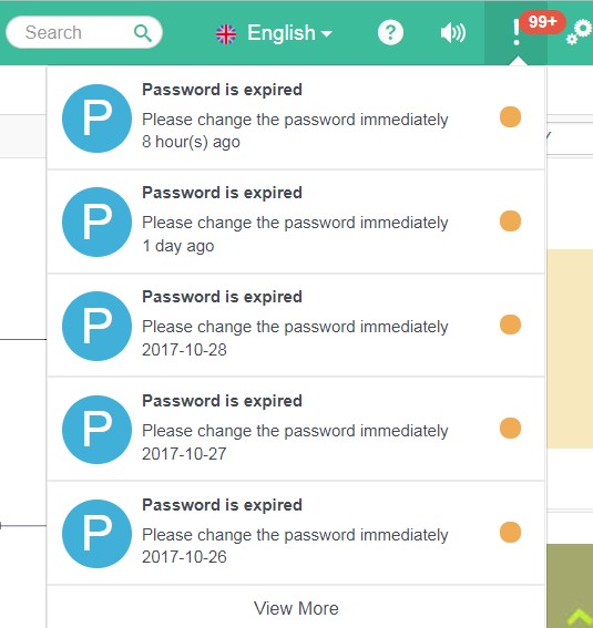
Alert Notification (Bottom Right Hand Corner)

Alert Detail
# Alert Implementation
Sending an Alert
//SysAlertUtil.java
public static void sendAlert(SysAlertObj alert, Collection<Long> recipient){...}
SysAlertObj is the basic object to describe the alert. Every type of alert required the specific SysAlertObj.
Attribute:
| Name | Description |
|---|---|
| alert | SysAlertObj, data of the alert. |
| recipient | A Group of user's id. |
# Alert Development
Developers need to provide 3 components to display an alert, they are Java Object, Alert List View and Notification View as well as Alert Details View.
# Define Alert Java Object
Every Alert need a Java object to describe the details of the alert.
This Java object need to inherit SysAlertObj and developers may need to pay attention to 4 points listed below:
//The below two methos must be implemented. Methods in CawJsonSerializable.
public void restoreJsonData(String jsonData) {
  ... //Base on jsonData, restore the Java object
}
public String saveJsonData() {
  ...//Transfer the current Java Object into Json String
}

//The below two methos can be implemented.
public String getMessageText() {
  return ""; //Basic information of the alert (HTML not supported)
}
public String getDetailText() {
  return ""; //Details of the alert (HTML not supported)
}
Note
saveJsonDatawill transfer the current Java object intoJSON String, however, the basic variable likeidandtypewill not be included in theJSON String.
MessageAlert Example
@SysAlert(value = "com.multiable.alert.message", rendererType = "com.multiable.alert.message")
public class MessageAlert extends SysAlertObj {
	public static final String TYPE = "com.multiable.alert.message";
	private static final long serialVersionUID = -1729512694173799571L;

	String message = "";
	String detail = "";

	public String getMessage() {
		return message;
	}
	public String getDetail() {
		return detail;
	}
	public void setMessage(String message) {
		this.message = message;
	}
	public void setDetail(String detail) {
		this.detail = detail;
	}
	/** overwrite methods **/
	@Override
	public void restoreJsonData(String jsonData) {
		JSONObject jsonObj = (JSONObject) JSON.parse(jsonData);
		this.setMessage(jsonObj.getString("message"));
		this.setDetail(jsonObj.getString("detail"));
	}

	@Override
	public String saveJsonData() {
		JSONObject jsonObj = new JSONObject();
		jsonObj.put("message", getMessage());
		jsonObj.put("detail", getDetail());
		return jsonObj.toJSONString();
	}

	@Override
	public String getMessageText() {
		return getMessage();
	};

	@Override
	public String getDetailText() {
		return getDetail();
	};

}
# Define the Alert View Renderer
Alert View Renderer defined the view of the alert. There are two types of view for alert: List view and Detail View. As a result, the Renderer included two types of API.
public interface SysAlertRender {
	public void encodeAlert(FacesContext context, SysAlertItem alert);

	public void decodeAlert(FacesContext context, SysAlertItem alert, String action);

	public void encodeAlertView(FacesContext context, SysAlertItem alert);

	public default String encodeAlertTitle(FacesContext context, SysAlertItem alert) {
		return WebUtil.encodeHtmlText(alert.getAlertObj().getMessageText());
	};

	public default String encodeAlertContent(FacesContext context, SysAlertItem alert) {
		return WebUtil.encodeHtmlText(alert.getAlertObj().getDetailText());
	};
}
API
encodeAlertis used to render the list view.decodeAlertis used to handle the action triggered by the alert.encodeAlertViewis used to render the detail view.encodeAlertTitleis not required and is used to simplify the alert. UseString(HTML supported) to show the title of the alert.encodeAlertContentis not required and is used to describe the alert's content usingString(HTML supported).
# Note
- Add a button and click event in the alert notification:
Use data-action in the view.
 <button type="button" data-action="myAction" data-dismiss="true">
   myAction
 </button>
Note:
- The data in
data-actionwill be passed to the 3rd parameter indecodeAlert.data-dismissis optional. Whentrue, the alert list will be dismissed once the user click the button.
- Use of
AbstractAlertRender
To simplify the development, M18 provided a basic class AbstractAlertRender. Developers can implement it or create another for its own use.
AbstractAlertRender render the alert list as follows:
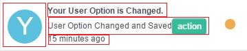
There are 4 parts:Icon Area、Title Area、Content Area、Time Stamp。
- Icon Area: defined in
getIcon()
protected ImageObject getIcon(SysAlertItem item) {
  return null;
}
- Title Area: 3 different methods to render the title
- Override the method
getMessageText()inSysAlertObj. HTML not supported. - Override the method
encodeAlertTitlein the renderer class. HTML supported. - Override the method
encodeTitleinAbstractAlertRender.
- Override the method
- Content Area: 3 different methods to render the content
- Override the method
getDetailText()inSysAlertObj. HTML not supported. - Override the method
encodeAlertContentin the renderer class. HTML supported. - Override the method
encodeItemContentinAbstractAlertRender
- Override the method
- Time Stamp: There are no method to override the time.
Development of Alert Detail View
Developers can implement
encodeAlertViewto define the detail view of alerts.If developers used
AbstractAlertRender, separated JSF can be created to design the detail view:- Override
getViewUrlto define a JSF view.
- Override
     protected String getViewUrl(SysAlertItem item) {
       return "/view/alert/messageAlert.faces";
     }
- Create a JSF view. Use
#{alertItem}in the view to get the Java objectSystemAlertItemif necessary.
     <h:form>
       <p>ID : #{alertItem.id}</p>
       <p>Title : #{alertItem.alertObj.messageText}</p>
       <p>Detail : #{alertItem.alertObj.detailText}</p>
     </h:form>
# Register the JAVA Object and Renderer
JAVA object and renderer need to be registered in M18. The JAVA object need to register with a registered renderer.
How to Register
Method 1: Using faces.xml
<sysalert-config>
  <rendererType name="com.multiable.alert.message">
    com.multiable.web.sysalert.render.MessageAlertRender
  </rendererType>

  <sysalert name="com.multiable.alert.message">
    <object>className</object>
    <renderer>com.multiable.alert.message</renderer>
  </sysalert>
</sysalert-config>
Note:
All settings must be put within the tag
sysalert-config.Register the rendere using
<rendererType name="code">className</rendererType>.
codemust be unique in the system.
classNamemust be a renderer implementedSysAlertRender.Register the Java object using
<sysalert name="code"><object>className</object></sysalert>.
codemust be unique in the system.
classNamemust be of typeSysAlertObj.When registering the Java object, a renderer must be used using
<renderer>renderCode</renderer>.The render must already be registered.
Method 2: Using Annotation in JAVA
- Register Renderer
  @SysAlertRenderer(rendererType = "com.multiable.alert.message")
  public class MessageAlertRender extends AbstractAlertRender {
    ...
  }
Use annotation @SysAlertRenderer in the renderer class. rendererType is the name of the renderer and must be unique in system.
- Register Java Object
  @SysAlert(value = "com.multiable.alert.message",
            rendererType = "com.multiable.alert.message")
  public class MessageAlert extends SysAlertObj {
    ...
  }
Use annotation @SysAlert in the Java object class. value is the name of the Java object and must be unique in system. rendererType used to define a registered renderer class.
# Link's Rules
# Introduction
http://192.168.10.214:8080/jsf/app.faces#employee/view/module/employee/870f5fee?id=63
In M18,different information is included in the link:
Information about the protocol, server host and port used. (
http://192.168.10.214:8080)M18's item path. (
/jsf)M18's system resource path. Relative to item path. (
/app.faces)Editor's information. (
#menuCode/resourcePath/randomKey)menuCode:codeofmenu. Defined innavmenu.xml.resourcePath: path of the editor. Usingemployeeas an example, its JSF view's path isview/module/employee.xhtml, therefore, itsresourcePathisview/module/employee.randomKeyis generated by the system.Parameters (
?id=63))
# Get the System Link
Use the following snippet to retrieve the link of a desired frame.
WebUtil.getFrameLink(String menuCode, Map<String, String> params);
# About Link's Parameters
If a view need to support parameters, developers need to get and decode the parameters in Java. In practice, analyzing parameters is done in method initalized in ViewListener.
# Use of PUSH
PUSH is a method in which the server send information to font-end. M18 has packaged the PUSH method and provided a simple API for developers.
PUSH, involving font-end and back-end, works as follow:
- Font-end send a connection to back-end.
- Back-end use Java service to listen the connection and process the information transferred.
- Front-end or Back-end close the connection.
# Front-end
In JavaScript, developers can use myView.createWebSocket(name, option, params) to create a web-socket connection.
name: Should be the same as the back-end service name.option: A list of function supported likeonmessage、onerror、onclose.params: Parameters send to backend.
# Backend
- Extend
CawWebSocket - Use the annotation
@ServerEndpoint.nameshould be the same as thenamein front-end. - Parameters passed by front-end can be found under the method
onOpen.
# Example
@ServerEndpoint(value = "/sysAlert", encoders = { SysAlertEncoder.class })
public class SysAlertWebSocket extends CawWebSocket {
	...
	public long getUid() {
		Long id = (Long) getProperty("uid");
		if (id == null) {
			return 0;
		}
		return id;
	}

	@Override
	public void onOpen(Session session, EndpointConfig ec) {
		// TODO Auto-generated method stub
		String userId = getRequestParam(session, "userId");
		if (userId != null) {
			setProperty("uid", ConvertLib.toLong(userId));
		} else {
			return;
		}
	}

	@Override
	public String getSocketKey() {
		long id = getUid();
		if (id > 0) {
			return String.valueOf(id);
		}
		return null;
	}

	@Override
	public boolean isSupportCluster() {
		return true;
	}

	...
}
var option = {};
option.onmessage = function(event) {
	...
};
option.onerror = function(event) {
    ...
};
this.webSocket = myView.createWebSocket('sysAlert', option, {userId : uid})
# Common API
Push Messages to Front-end
Developers can find useful API in WebSocketUtil.java:
public static void sendMessage(String webSocket, String message, Predicate<CawWebSocket> filter) {
  ...
}

public static void sendObject(String webSocket, Object message, Predicate<CawWebSocket> filter) {
  ...
}

public static void sendText(String webSocket, String message, Predicate<String> keyPredicate)  {

}
Note:
- Parameter
webSocketis the value ofvalueof the annoation@ServerEndpoint.- The 3rd parameter
filterandkeyPredicateis used to define which websocket the information will be send.- The 2nd parameter is used to defind the information, in text, need to send. If
sendObjectis used, attributeencodersshould be added in annotation@serverEndpointto encode the object into text.- Important: If M18 is inside a clustering architecture, only
sendTextcan be used to send message to multiple server.
# Home's Components Development
In M18's home, there are two components that can be extended.
spotlight: In the main tool bar, while users search the menu using the search bar, spotlight component will be triggered.spotlightwill base on user input, search in M18 and display the result on the screen.widget:Used to display a specific view. User can use developedwidgetand display it in Home using UDF layout.
# Spotlight Component
spotlight's functions':Searching and Display Result。
Therefore, spotlight component include two parts for development.
# Searching
spotlight use interface SpotlightHelper to implement the function Searching,keywords and result will be transferred during searching using CawSpotlight.
public interface SpotlightHelper extends Serializable {
	public void doSearch(FacesContext context, CawSpotlight spotlight);
	public void spotlightInit(FaceletContext ctx, CawSpotlight spotlight, 	UIComponent container);
}
Note
spotlightInitwill be triggered whenspotlightinitalized.doSearchwill be triggered when user input keywords.CawSpotlightincludes all the information about the component and about the searching.CawSpotlight.setRendered(boolean rendered)can be used to indicate if the component should be visible. For example, if the search result is empty, change the component to be invisible using this method.
Define the Rendered Variables & Return Search Result
spotlight component need to search in M18, return the result and variables in order to determine how the search result will be presented.
Using CawSpotlight.setData(String key, Object obj) to return the result and variables.
public void doSearch(FacesContext context, CawSpotlight spotlight) {
    String searchKey = spotlight.getSearchKey();
    List<NavMenuItem> items = new ArrayList<>();
    ... // do search with searchKey
    spotlight.setData("searchResult", items); //Set result to spotlight
    spotlight.setRendered(items.size() > 0);
}
In the page of search result, developers can use #{content.data.key} to access the variables defined by setData. key is the key in setData.
# Search Result Display
Use a JSF file to define the view of spotlight. As spotlight is a component, <view>, <body>, <form> tags should not exists and the view should be encoded in <ui:composition></ui:composition>.
<html xmlns="http://www.w3.org/1999/xhtml"
	xmlns:f="http://java.sun.com/jsf/core"
	xmlns:h="http://java.sun.com/jsf/html"
	xmlns:ui="http://java.sun.com/jsf/facelets"
	xmlns:caw="http://www.cloud-at-work.com">
	<ui:composition>
		<h:outputScript name="menu.min.js" library="js/spotlight"></h:outputScript>
		<h:outputStylesheet name="menu.min.css" library="css/spotlight"></h:outputStylesheet>
		<h5 class="container spotlight-title">#{caw:mess('spotlight.menu')}</h5>
		<caw:menuSpotlight value="#{content.data.searchResult}"></caw:menuSpotlight>
	</ui:composition>
</html>
# Spotlight Registration
Register spotlight in app.xml.
<app>
  <spotlight name="menu"
             mess="share.spotlight.menu"
             src="/spotlight/menu.xhtml"
             helper="com.multiable.web.spotlight.MenuSpotlight">
  </spotlight>
</app>
spotlight Attributes
| Name | Description |
|---|---|
| name | spotlight name,Unqiue Key. |
| mess | spotlight description, messCode |
| src | spotlight jsf file |
| helper | spotlight helper class |
# Widget Component
Unlike spotlight, widget does not need to trigger by user. After a widget have been setup in Home. It will be displayed in the interface when M18 is re-opened.
widget component includes two views: **Setting (Optional) ** and Display.
# Display View
Developers can provide a Java class, implemented WidgetHelper, to prepare data in Display.
public interface WidgetHelper extends Serializable {
	public void prepareWidget(FacesContext context, CawWidgetContent content);
	public void widgetInit(FaceletContext ctx, CawWidgetContent content, UIComponent container);
}
Note
widgetInitonly triggered whenwidgetinitialized.prepareWidgettriggered whenwidgetis displayed, used in order to refresh the data.CawWidgetContentused to retrieve all the information about thewidget.
Developers can use #{content.data.key} to access the variable definded by CawWidgetContent.setData(String key, Object obj). key is the key in setData.
Use a JSF file to define the view of Display. As Display is a component, <view>, <body>, <form> tags should not exists and the view should be encoded in <ui:composition></ui:composition>.
# Setting View
Setting need a Java object to store the setting information, the Java object should be able to transfer between Json and Java Object using JSON.toJSONString and JSON.parseObject. POJO object or Java object implemented CawJsonSerializable is recommended.
Use a JSF file to define the view of Setting. Use #{content.option} to get the widget setting object. As Setting is a component, <view>, <body>, <form> tags should not exists and the view should be encoded in <ui:composition></ui:composition>.
Setting view can link to a Java Bean which implemented WidgetOptionBean.
# Registration
Register widget in app.xml.
<app>
	<widget name="linkWidget" mess="widget.linkWidget"
            src="/widget/linkWidget.xhtml"
            helper="com.multiable.web.widget.LinkWidget"
            width="6" height="5" >
		<icon name="linkWidget.jpg" library="img/widget"></icon>
		<description mess="widget.linkWidget.description">
			<![CDATA[<p>A widget to show a link with an image!</p>]]>
		</description>
		<option src="/view/widget/linkWidgetOption.xhtml">
          com.multiable.web.widget.LinkOption
      	</option>
	</widget>
</app>
widget Attributes
| Name | Description |
|---|---|
| name | widget name. Unique key. |
| mess | widget description. messCode |
| src | widget JSF file |
| helper | widget Java class helper |
| width | widget default width (Max: 12) |
| height | widget default height (Default: 30px) |
<icon/> is to define the icon of the widget.
<description></description is to define the description of the widget. Use messcode in attribute mess or input text in attribute description to define the descrption. HTML supported.
<option src="resourcePath">className</option> used to define the widget's setting information. Attribute src define the path for the view while className define the Java Object used in the setting.
# Theme Development
# Introduction
# Type of Theme
M18 divided theme into System Theme and UDF Theme.
System Theme: Can only be modified by developers.
UDF Theme: Can be modified by user. Every user can have one UDF Theme. Users can use the current theme as template, select their desired color and save as an UDF Theme.
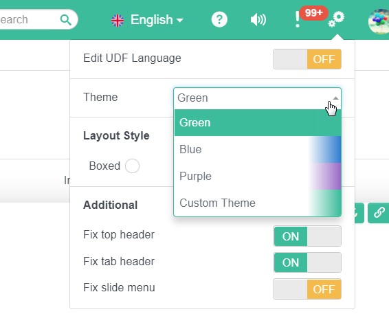
# User Definded
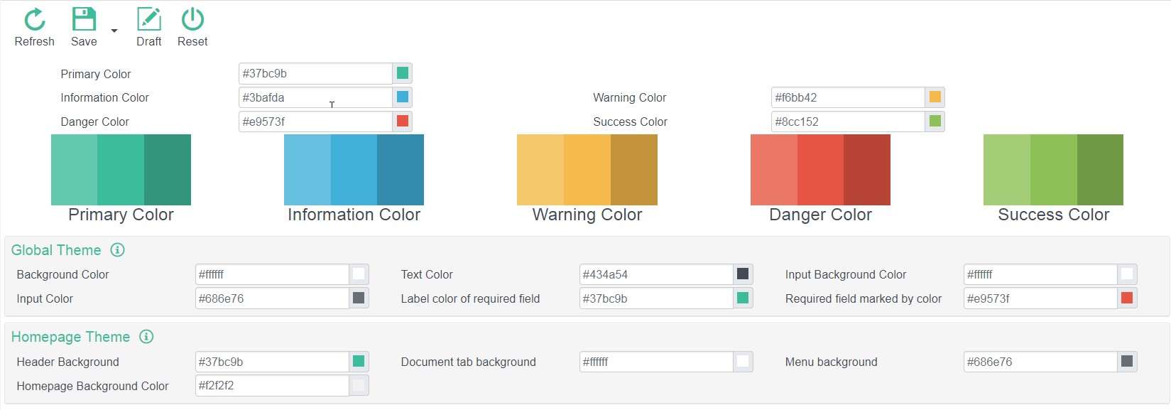
M18 provided a "Theme Color Palette" which included a set of Color Variable. User can define different colors to different Color Variables such that the component using those Color Variables will be changed together.
Color Variable includes
M18 System Basic Color Variable
Primary、Info、Warning、Danger、SuccessM18 also provide other Color Variables to control component colors like
System Text Color,Required Field Color, etc.Special Page Color Variable
M18 provide Color Variable for Home Page such that user can choose their own color.
Developer Color Variable
Developer can defined Color Variable and use it in specific pages.
# Create/Modify Theme CSS File
Theme CSS File is necessary only when the page color should change base on the theme
# Naming and Path Rules
- Theme css File must put under
WebContent/resources/themes/. - Theme css File Name must be in the form of
*.dynamic.css. (*is any words)
# How to Writing a CSS File
//set {app-header-background} = {primary}
set {app-logo-background} = {app-header-background + 10%}
set {app-header-color} = #fafafa
set {app-header-active-background} = {app-header-background + 10%}
//set {app-menu-background} = {darkGray-}
set {app-menu-color} = {lightGray}
set {app-menu-active-background} = {app-menu-background + 40%}
set {app-menu-active-color} = {app-menu-color - 50%}
//set {app-tab-background} = {body-bg}
set {app-active-tab} = {warning * 0.5}
set {app-notice-tab} = {primary * 0.3}
//set {app-homepage-background} = {body-bg}

.theme-{theme} .main-container,
.theme-{theme} .main-container:before {
	background-color: {app-homepage-background};
}

.theme-{theme} #header.header-container {
  background-color: {app-header-background};
}

.theme-{theme} #header.header-container header.top-header .logo {
  background-color: {app-logo-background};
}

.theme-{theme} #header.header-container header.top-header .header-link {
  color: {app-header-color};
}
Define a variable:
set {Variable Name} = Valuevaluecan be a defined value or other variables. If other variables are used,{Other Variable Name}have to be used.Operator:
-,+,*-: Color fades. Usea%at the back in whichais a number between0-100.+: Color darker. Usea%at the back in whichais a number between0-100.*: Transparency,Define a number at the back.Using Variable
Use
{Variable Name}in css file.
# Predefined Variables
- System Basic Color Variables:
primary、info、warning、danger、success、gray、lightGray、darkGray
The above color variables includes two additional variables for color tunning. Use primary as an example, there exists two variables called primary-,primary+.
Bootstrap Color Variable
Ref:
WebContent/themes/css/caw.variable.dynamic.css
# Adding a Theme
Define <theme-config> in faces.xml.
<faces>
  <theme-config>
    <theme code="blue" description="theme.blue">
      <color name="primary" value="#2D7DD2"></color>
      <color name="info" value="#3BAFDA"></color>
      <color name="warning" value="#EEB902"></color>
      <color name="danger" value="#F45D01"></color>
      <color name="success" value="#97CC04"></color>
      <color name="app-homepage-background" value="#f9f9f9"/>
      <token key="input-bg-disabled" value="{lightGray}"></token>
	 </theme>
  </theme-config>
</faces>
To configure a theme-palette, at least 5 basic colors need to be defined.
theme Attributes:
| Name | Description |
|---|---|
| code | Unique Key |
| description | Description in messCode format |
<color> defined the color variable. name is the variable name, value is the value.
<token> defined the relation between the color variables. key is the variable name, value is an expression of the other variable.
# Supporting UDF Theme in Editor
# Registration
Define <specification> tag under <theme-config> in faces.xml.
<faces>
  <theme-config>
    <specification code="app"
                   description="theme.spec.app"
                   demo="/view/theme/appDemo.xhtml">
      <token key="app-header-background" value="{primary}"
             description="theme.app.header.bg"/>
      <token key="app-tab-background" value="{body-bg}"
             description="theme.app.tab.bg"/>
      <token key="app-menu-background" value="{darkGray-}"
             description="theme.app.menu.bg"/>
      <token key="app-homepage-background" value="{body-bg + 5%}"
             description="theme.app.homepage.bg"/>
      <resource name="theme/app.dynamic.css" library="themes/css"/>
	</specification>
  </theme-config>
</faces>
specification Attributes:
| Name | Description |
|---|---|
| code | Unique Key |
| description | Description in messCode format. |
| demo | Example file |
token Attributes:
| Name | Description |
|---|---|
| key | Variable Name |
| value | Default Value. Must use the system-definded variable. |
| description | Description in messCode format. |
resource used to define the css file.
# Create/Use of CSS File
Theme CSS File is a dynamic.css file. Please refer to [Writing Them CSS File](#Writing Them CSS File) for more details.
# Create Demo Page
Demo page is a JSF file, following the rules of developing JSF will be enough. However, <view>, <body>, <form> should not be used and all the tags must put within <ui:composition>.
# Extension of Existing Functions
# Extension of Editor
Extension of Editor refer to create a new function based on the existing editor.
# Registration of Extension
Register the Extension of Editor in app.xml.
<app>
  <extension>
		<view code="formComp" app="caw" filter="" type="frame">
			<controller></controller>
			<page>/extension/extensionTest.xhtml</page>
			<listener></listener>
		</view>
		<view code="employee" app="caw" filter="" type="frame" apDebug="true">
			<page>/extension/extensionEmployee.xhtml</page>
		</view>
  </extension>
</app>
<view>defined the view need to extend.- Attributes:
| Name | Description |
|---|---|
| code | Target view's code. code is the code defined in navmenu.xml. |
| app | The app name where the view's is in. |
| filter | Filter the menu code which are needed to apply the extension. |
| type | Type of target view. Options: frame,dialog,`namecard |
ViewFilter Interface:
public interface ViewFilter extends Serializable{
	public boolean isViewIncluded(ViewExtension extension, ViewType type, String code);
}
ViewFilter is used to indicate if the view needed to apply the extension. Return true to apply.
<controller>define acontrollerfor the extension. Controller must extend one of the following class base on the Java type of the target view:ViewControllerWrapper、DialogControllerWrapper、FrameControllerWrapper、ModuleControllerWrapper<page>define aXHTMLfor the extension.<listener>define aViewListenerfor the extension.
# Extension of Tags & Adding a New Component
Before the start of an extension, target, exists in the original view, need to be definded in which the extension should take place.
<caw:extendComponent target="targetId", action="before|after|prepend|append"></caw:extendComponent>
action defined the position in which the extension should take place:
- before : Extension take place in front of the target. The new component is grouped under the same parent tag.
- after:Extension take place after the target. The new component is grouped under the same parent tag.
- prepend:Extension take place before the first child tag of the target component.
- append: Extension take place after the last child tag of the target component.
<caw:extendComponent target="code" action="before">
  <!--Add a button in front of the component with id = `code` -->
  <caw:commandButton value="Extend Button"></caw:commandButton>
</caw:extendComponent>

<caw:extendComponent target="button" action="prepend">
  	<!--Add a click event to the button -->
  	<caw:ajax event="click" listener="xxbean.doAction"></caw:ajax>
</caw:extendComponent>
# Extend/Modify Component's Attributes
Same as the previous session, modifying the attributes of an existing components need <caw:extendComponent> to define the target component. However, attribute action can be ignored.
//Original View
<caw:inputText tableName="employee" columnName="code" style="border: 1px solid blue"></caw:inputText>

//Extension View
<caw:extendComponent target="employee_code">
  <caw:setProperty name="style" value="background-color: red;"
                   updateType="extend"/>
</caw:extendComponent>
Use <caw:setProperty> to modify the target's attributes. Attributes:
| Name | Description |
|---|---|
| name | Attribute name |
| value | New attribute value |
| updateType | Extension method. Options:extend, replace |
For style, styleClass:
Use the above XML as an example, style will be the combination of the existing style and new style. The component will be shown as follow:

If the code modified like:
<caw:extendComponent target="employee_code">
  <caw:setProperty name="style" value="background-color: red;"
                   updateType="replace"/>
</caw:extendComponent>
The target component will only have one style and result will be shown as follow:

For other Attributes:
If the attribute's value is a literalValue, not an EL expression, the original value will be replaced by the new value (updateType=replace). value can be extended (updateType=extend) only when value is used as an EL expression.
//Original View
<caw:inputText tableName="employee" columnName="code" maxlength="10"/>

//Extension View
<caw:extendComponent target="employee_code">
   <caw:setProperty name="style" value="background-color: red;"
                   updateType="replace"/>
   <caw:setProperty name="maxlength" value="15"/>
</caw:extendComponent>
Before extend maxlength:

After extension, the maxlength changed to 15

If the extension modified as follow:
<caw:extendComponent target="employee_code">
   <caw:setProperty name="style" value="background-color: red;"
                   updateType="replace"/>
   <caw:setProperty name="maxlength" value="#{xxxBean.testProperty(VALUE)}"
                    updateType="extend"/>
</caw:extendComponent>
//xxxBean
public int testProperty(int value) {
  return value + 10;
}
EL expression is used in the extension, VALUE inside the EL expression represent the original value.

If replace is used for the attribute updateType, VALUE will become 0.

# Decorator
# Introduction
Decorator, is an interface, provided to modify/interact with the result in a function. Decorators should be defined only when the result of a function or the process is expected to be modified/interrupted by third parties.
To create/use a decorator:
- Define a decorator (an interface);
- Enable this decorator in Java.
Two usages in decorator:
- Event Type: Notify all registered decorators to do an action.
- Extension Type: Notify all registered decorators to run a function and return a value to the original function.
# Define a decorator
- Define an interface which extend
ViewDecorator. - Define API which expected the method is used by third parties. Example: Version Compare Decorator
public interface VersionCompareDecorator extends ViewDecorator {
	public List<FieldLocator> versionCompare(SqlEntity entity, SqlEntity comparedEntity);
}
# Enable a Decorator
After defined a decorator, the decorator need to be enabled in the Java files which is needed to be extended. There are two methods to enable the decorator:
- Even Type:
  //ViewController
  public <T extends ViewDecorator> void notifyDecorator(Class<T> target, DecorateAction<T> action, Object[] params)
  controller.notifyDecorator(MyDecorator.class,
                            (decorator, params) -> decorator.myDecoratorAction(params[0], params[1]),
                             new Object[]{param1, param2});
target: Java class of the decorator. For example:VersionCompareDecorator.action: Event interface class implementedDecorateAction. Example:
    public interface DecorateAction<T> {
    	public void doAction(T decorator, Object[] params);
    }
params: Used to pass the parameters needed inDecorateAction.
- Extension Type:
   //ViewController
   public <T extends ViewDecorator> void visitDecorator(Class<T> target, DecorateVisitor<T> visitor, Object[] params, DecorateVisitCallback<T> callback);
   controller.visitDecorator(VersionCompareDecorator.class,
   				(decorator, params) -> decorator.versionCompare((SqlEntity) params[0], (SqlEntity) params[1]),
   				new Object[] { compareEntity, comparedEntity }, callback);
target: Java class of the decorator. For example:VersionCompareDecorator.visitor: Event interface class implementedDecorateVisitor.
     public interface DecorateVisitor<T> {
     	public Object visit(T decorator, Object[] params);
     }
params: Used to pass the parameters needed inDecorateVisitor.callback: Defined the function implementedDecorateVisitCallback. Used to analysis the return value fromDecorateVisitorand decided if other decorators should be run. Iffalse, other decorators will not be notified.
     public interface DecorateVisitCallback<T> {
     	public boolean visited(T decorator, Object returnObject);
     }
# Use of Decorator in Extension Prospect
Developers must implement the existing decorator to use its features.
- Decorator can be a standalone Java class
- Decorator can be a Java Bean
- Decorator can be a View Listener
Decorators must be registered in order to work properly:
As Java Bean and ViewListener already registered, no action need to be done if the decorator is a Java Bean or a ViewListener.
If decorator is a Java class, follow the steps to register:
Register using tag
<caw:viewDecorator class="className"/>inXHTML.Register using tag
<caw:viewDecorator value="#{returnDecorator()}"inXHTML.Register in
initializedin ViewListener using the following snippet:
controller.addViewDecorator(myDecorator);
# Create a New Component
If the new component need to include the features in M18, please read to the following information.
# Support UDF Mess
Add an attribute data-mess to the component, value of the attribute should be the messCode of the component.
<label data-mess="employee">Employee</label>
Users can right click the above label component and adjust the mess after UDF Mess is enabled.
# Support Locator
If back-end returns error messages includes locators, front-end will base on the locator information and hightlight the component(s). 当后台的错误消息,包含组件定位时,前端会根据组件定位信息,找到相应组件,并处罚“高亮”事件。
Locator grouped tableName, columnName and rowId to form tableName.columnName.rowId.
- If module:table is 1:1, locator information will be
tableName.columnName. - If module:table is 1:N, locator information will be
tableName.columnName.rowId. - If locator refering a table, locator information will be
tableName.
The component must defined its "Locator Information" in the attribute data-locator in the outermost layer (e.g. div). If back-end returns a message with locator information, the component will be highlighted.
In JavaScript, we can use the following snippet to handle the hightlight functions:
$('#componentId').on('highlight', function(event, locator) {
 	console.log(event.highlight); //Type of highlight. Options: `message`, `versionCompare`.
  	console.log(event.status);//Status of hightlight. `on` means highlighted; `off` means not hightlighted.
});
# Support UDF Functions
M18 has the following UDF functions:
- UDF Layout
- UDF Fields
- UDF Attributes
UDF Layout is already implemented in all Editor.
If new components need to support UDF Fields and UDF Attributes, you may refer to following guidelines.
# Support UDF Fields
Configure the faces.xml to declare which types of fields need to be supported.
<component-config>
  <faces-library ns="http://www.cloud-at-work.com">
    <description>faces.lib.caw</description>
    <tag name="inputText">
    	<udfSupport udfType="string"/>
    </tag>
  </faces-library>
</component-config>
From the above example, <udfSupport> is used to declare inputText should be supported in UDF Fields like a String.
Types of UDF Fields:
string, text, number, date, boolean, color, image, combo, lookup
# Support UDF Attributes
Configurate the faces.xml to declare which attributes need to be supported.
Example:
<tag name="inputText">
  ...
  <udfSupport udfType="string"
              helper="com.multiable.web.udf.InputTextHelper" height="320">
    <attribute name="mess-label" source="labelMess" editor="mess">
      faces.caw.faces.label
    </attribute>
    <attribute name="mess-info" editor="mess">
      faces.caw.faces.info
    </attribute>
    <attribute name="markedRequired" type="Boolean" source="colReq">
      faces.caw.faces.required
    </attribute>
    <attribute name="readonly" type="Boolean" editable="false">
      faces.caw.faces.readonly
    </attribute>
    <attribute name="maxlength" type="Integer" source="textLength">
      faces.caw.faces.length
    </attribute>
  </udfSupport>
  ...
</tag>
<attribute> is used to declare the attribute information.
Attributes:
| Name | Description |
|---|---|
| name | Attribute name. |
| type | Attribute type. Options: Byte, Boolean, Character, Short, Integer, Long, Float, Double, String |
| default | Default value |
| source | Defined the fields in which the value will be used. Options: code, desc, colType, labelMess, colReq, textLength, numPoint, numDecimal, searchTypeId, stSearchType. |
| editor | Define the value type of the attribute. Option: css, mess (Only valid when type = String) |
| visitable | Indicate if the attribute should be shown in the setting editor. |
| editable | Indicate if the attribute can be edited in the setting editor. |
| tip | Define the tooltip. Type: messCode |
| option | Define the pattern if the value of the attribute can be chosen in a drop down menu. |
| src | Define a JSF view for the attribute setting. |
| required | Indicate if the attribute is required. |
# Setting for Component
If developers want to create an additional setting page for the component, please refer to the following guidelines:
- Define setting JSF view in
settingUrl
   <udfSupport udfType="string" settingUrl="/view/dialog/myConfig.xhtml">
     ...
   </udfSupport>
- Pass parameters to the setting
Setting will pop up as a dialog, attributes, a Map<String, Object> storing all the attributes' values, will be passed to the setting page.
- Return value from the setting
The new Map<String, Object> must be return back when the dialog is closed.
# How To Use the UDF Attribute In Component
- If the attribute already exists in the component, no work need to be done.
- If the attribute is new to the component, an
UdfHelperneed to be created.
To create an UdfHelper:
Define a Java class which extend
UdfHelper.Declare the attribute
helperin<udfSupport>.
   <udfSupport udfType="string"
               helper="com.multiable.web.udf.InputTextHelper">
     ...
   </udfSupport>
- Override two methods in
UdfHelper.
   public void applyTag(FaceletContext ctx, UIComponent component, Tag tag) {
       TagAttribute attribute = tag.getAttributes().getAttribute("myProp");
     	String attrValue = attribute.getValue();
       component.getAttributes().put('style', attrValue);
   }
In this method, all the component's attributes are stored inside tag. Get the non-supported UDF attributes by using the key myProp and handle it.
   public void applyAttribute(FacesContext context, UIComponent component, Map<String, Object> attributes) {
     String attrValue = attributes.get('myProp');
      component.getAttributes().put('style', attrValue);
   }
In this method, all the component's attributes are stored inside attributes, handle myProp in the same way.
# Special Components/Features
# Module Wizard
Module Wizard is a group of modules displayed to users one by one such that users can finish a list of complicated modifications using the wizard.
Two main elements in module wizard:
- key: Unique key
- path: Wizard view file
# Enable Wizard
- Enable wizard using Java
WebUtil.startGuide("udfEditor", '/view/frame/udfEditorGuide.xhtml');
- Enable wizard using JavaScript
  top.myApp.startGuide({
    key: 'udfEditor',
    path: '/view/frame/udfEditorGuide.xhtml'
  });
# Create a Wizard
Wizard view follows the normal rules of writing a JSF view.
In wizard view, <caw:frameWizard> is used to define the content of wizard.
Example:
<caw:beanDeclare name="ueGuide"></caw:beanDeclare>
<h:form id="form">
  <caw:frameWizard id="wizard"
                   style="height: 100%;"
                   completeValidator="#{ueGuide.validateComplete}">
    <f:facet name="start">
	 <!--Start View-->
    </f:facet>
    <f:facet name="end">
      <!--End View-->
    </f:facet>
    <f:facet name="message">
      <!--Message Display-->
    </f:facet>
    <caw:frameStep id="udfEditor" menuCode="udfEditor"
                   listener="#{ueGuide.getStepListener(0)}">
      <!--Step 1 View-->
    </caw:frameStep>
    <caw:frameStep id="udfMenu" menuCode="udfMenu"
                   listener="#{ueGuide.getStepListener(1)}"
                   validator="#{ueGuide.validateStep}">
      <!--Step 2 View-->
    </caw:frameStep>
    <caw:frameStep id="moduleFuncSetting" menuCode="moduleFuncSetting"
                   listener="#{ueGuide.getStepListener(2)}"
                   validator="#{ueGuide.validateStep}">
   	  <!--Step 3 View-->
    </caw:frameStep>
  </caw:frameWizard>
</h:form>
Attributes
| Name | Description |
|---|---|
| completeValidator | EL Expression. Determine if the step is completed with no error. |
| onChange | Triggered when step changed. |
| onComplete | Triggered when all steps completed. |
<caw:frameWizard completeValidator="xxBean.validateComplete"
                 onChange="xxBean.onWizardChange"
                 onComplete="xxBean.onWizardComplete">
  ...
</caw:frameWizard>
//xxBean.java
public void validateComplete(FacesContext context, UIComponent component, FrameWizardCompleteEvent event) {
  if(...) {
    event.setValid(false); //Indicate the wizard is not completed.
  }
}

public void onWizardChange(FrameWizardChangeEvent event) {
}

public void onWizardComplete(FrameWizardCompleteEvent event) {
}
<caw:frameStep used to define the information about a step.
Attributes:
| Name | Description |
|---|---|
| menuCode | Define the step' view. |
| listener | Define the step's ViewListener |
| params | Define a Map<String, String> and pass to the view. |
| validator | Define a method to validate if it should be proceed to the next step. Use event.setValid(false) to prohibit the user to proceed. |
validator Example:
<caw:frameStep id="step1" validator="xxBean.validateStep"></caw:frameStep>
//xxBean
public void validateStep(FacesContext context, UIComponent component, FrameWizardChagneEvent event) {
  String step = component.getId();
  if("step1".equals(step)) {
    event.setValid(false);
  }
}
Customize facets
Define views for frameWizard in facets:
facets Name | Description |
|---|---|
| start | Define a start view |
| end | Define an end view |
| message | Define a message view |
# Progress Bar
# Introduction
Progress bar is a feature that display a bar in the user interface showing the progress of the process.
# Create & Destory
Create and destory of a progress bar can only be done in JavaScript.
# Create Default Progress Bar
var progressBar = myView.createProgressbar('batchDelete', {
    colorStyle: 'primary',
    interruptable: false,
    progress : {startValue : 5,
                duration: 90,
                description: 'progress.batchDelete'}
  });

| Name | Description |
|---|---|
| colorStyle | Define the color style. Options: primary, warning, info, danger, success。 |
| interruptable | Indicate if it can be interrupted. Default: false. |
| showBar | Indicate if the bar should be shown. Default: true. |
| showProgressText | Indicate if percentage of the progress should be shown. Default: true. |
| showDescription | Indicate if description should be shown. Default: true. |
| progress | Setting for back-end. startValue define the starting percentage. duration define the maximum value can be reached in back-end. description define the description of the progress. |
# Create UDF Progress Bar
//Define a progress bar interface and display it in the UI.
var myProgressUI = $('<div></div>').appendTo(document.body);

// Create a progress bar object.
var progress = myView.createProgress('myProgressBar', {});

// Listen for the action ready/update/end/destroy and update the UI.
progress.on('update', function(data){
  myProgressUI.text(data.progress + '%');
});
# Enable the Progress Bar
// Default Progress Bar
progressBar.start(function() {
  //action here
});

// UDF Progress Bar
progress.start(function() {});
Perform an action when the progress started.
# Destory the Progress Bar
// Destory the default progress bar
progressBar.destory();

// Destory the UDF progress bar
progress.destory();
myProgressUI.remove();
# Update the Progress Bar
Update in Front-end JavaScript
var data = {
	progress: 50,
  	progressDescription: 'description for current action',
  	description: ''
};

//Progress Object
progress.update(data);

//ProgressBar Object (Default progress bar UI)
progressBar.update(data);
Update in Back-end Java
//ProgressUtil.java
public static void updateProcess(int progressValue, String progressDescription);

public static ProcessStatus updateProcessStatus(int progressValue, String ProgressDescription);
Parameter progressValue define the current percentage of completion of the progress.
Parameter progressDescription define the current description of the progress.
Difference between updateProcess andupdateProcessStatus:
updateProcess will check if the progress have been interrupted. If it is interrupted, system will thrown exception.
updateProcessStatus will not thrown exception. If the progress have been interrupted, it will not update the user interface.
Status of Progress Bar:
public enum ProcessStatus {
  NULL, INITIALIZED, RUNNING, COMPLETED, INTERRUPTED
}
# Progress Bar Common API
- Check if the progress have been interrupted
  ProgressUtil.checkInterruptStatus(); //If interrupted, thrown exception.
  ProgressUtil.isInterrupted(); //If interrupted, will not thrown exception.
- Create a New Child Progress Bar
  //Parameter: String key, String description, int startValue, int duration
  ProgressUtil.startProgressProcess("key", "description", 40, 20);
  ProgressUtil.startGroupProcess("key", "description", 40, 20)
key: Unqiue key of the child progress bar.
description: Description of the child progress bar.
startValue: Start value of the child progress bar.
duration: The percentage used by the parent progress bar when the child progress bar exists.
- Create a Child Progress Bar
  //Parameters: String key, String description, int startValue, int duration
  ProgressUtil.startWrappedProcess("key", "description", 40, 20);
Example:
  public void mainTask() {
    ProgressUtil.startGroupProcess("mainTask", "Main Task");
    ...
    ProgressUtil.startWrappedProcess("wrapTask", "Wrapped Task", 40, 20);
    wrapTask();
    ProgressUtil.endProcess():
    ...
    ProgressUtil.endProcess();
  }

  public void wrapTask() {
    ProgressUtil.startProgressProcess("wrapTask", "Wrapped Task");
    ...
    ProgressUtil.updateProgress(50); //mainTask progress percentage will become (40+20*50%=) 50%
    ...
    ProgressUtil.endProcess();
  }
- Add Progress Description
  //Parameters: String key, String description
  ProgressUtil.startProgressProcess("key", "Description");
  ProgressUtil.startGroupProcess("key", "Description")
- Complete the Progress
ProgressUtil.endProcess();
# Multilingual
M18 support multilingual. M18 provided 3 basic languages, they are English, Chinese(Traditional), Chinese(Simplified). User can define other language by using UDF Language.
Developers can use mess tools to insert/update/delete the mess. Every mess records has one messCode, developers can use this messCode to retrieve the related text with different languages. All mess records can be retrieved in back-end Java class while JavaScript can only retrieve the mess with webmess = true.
- Back-end Java can retrieve text by using
CawGlobal.getMess("messCode"). - Front-end JavaScript can retrieve text by using
myView.getMess('messCode').
Language Change Event
When users change language, language change event will be triggered.
- JavaScript Listen on Language Change Event
  $(document).on(JsView.EVENT.BEFORE_LANGCHANGE, function(event) {
    //Do something before language changed
  })
  $(document).on(JsView.EVENT.AFTER_LANGCHANGE, function(event) {
    //Do something after language changed
  })
Java Listen on Language Change Event
Use the method
actionPerformedinViewListener:
  public void actionPerformed(ViewActionEvent vae) {
    if(WebUtil.langChangeCommand.equals(vae.getActionCommand())) {
      //do something
    }
  }
# Common API
# JSF View Common Setting
# Available Configuration Items
<caw:view> Setting
readonlyanddisabledattributes inview
  <caw:view readonly="#{expression}" disabled="#{expression}">
   ...
  </caw:view>
The above properties is used to unite the readonly and disabled properties of all components inside a view.
onConstructattribute
  <caw:view onConstruct="#{method}">
    ...
  </caw:view>
Method triggered when ViewController is created.
onDestroyattribute
  <caw:view onDestroy="#{method}">
    ...
  </caw:view>
Method triggered when view is destroyed.
Pass more parameters in Ajax request
Ajax request is sent based on action URL. If more information is needed in the Ajax request, the following snippets will be helpful:
<caw:view>
  <caw:actionPraram name="paramName" value="paramValue"/>
  ...
</caw:view>
paramValue can be retrieved from requestParam everytime the Ajax request is sent.
# Common Function
- Get the text from
messCode:#{caw:mess('messCode')}
<label>#{caw:mess('messCode')}</label>
- Get the component
id:#{caw:webID('id')}
  <caw:inputText id="textId"></caw:inputText>
  <caw:commandButton update="#{caw:webID('textId')}"></caw:commandButton>
- Get the system resource URL:
#{caw:resourceUrl('name', 'library')}
# Java Common Front-end API
- Update component using
id:
WebUtil.update("id");
- Change the status of a component:
  WebUtil.setDisabled(false, "component1Id", "component2Id"); //Update the `disable` attribute
  WebUtil.setRendered(false, "component1Id", "component2Id"); //Update the `render` attribute
  WebUtil.setVisible(false, "component1Id", "component2Id");  //Update the `visible` attribute
Note:
- Only available when the component has those attributes.
- The above snippet only change the value of the attributes, to apply the change in UI, update the user interface with
WebUitl.update("id")is needed.- To update the
renderedattribute, parent component need to be updated.- If developers already declare the value of
renderandvisibletofalsein JSF view, changing the status in Java is not possible.- If developers already declare the value of
disabletotruein JSF view, changing the status in Java is not possible.
- Setting Focus:
WebUtil.focusComponent("componentId");
Note:
Focus in UI is affected by many factors including browser and user behavior, the above snippet does not guarantee it must focus on the target.
Ususally used when the view is initialized。
- Pass parameters to Ajax's
oncomplete
FacesUtil.getAssistant().addCallbackParam("callback", 5);
  ajax.oncomplete = function(xhr, status, args) {
    if(args.callback > 4) {
      //xxxxx
    }
  }
- Finding Component:
WebUtil.findComponent('componentId');
Utility Class
WebUtil.java: Common methods for font-end.MessageUtil.java: Common methods for font-end messaging.SysAlertUtil.java: Common methods for System Alert.
# Javascript Common API
- Trigger action in ViewListener through JavaScript:
myView.triggerAction('actionCommand');
actionPerformed in ViewListener will be triggered.
- Trigger module actions(Save/Create/Read...) through JavaScript:
myFrame.triggerAction('read', {id: 32});
- Update component using JavaScript:
myView.ajaxUpdate('componentId');
- Getting mess using
messCode:
myView.getMess('messCode'); // `webMess` = true
- JavaScript common method can be found in
cawView.js.